


The Canadian Premier League kicks off this weekend. But at the beginning of April, all eyes were fixed on Toronto as the Canadian Premier League and its clubs unveiled their kits for the inaugural season of the new Canadian professional soccer league.
That evening, the likes of Cavalry FC midfielder Nik Ledgerwood and Pacific FC forward Marcus Haber were asked to channel their inner Right Said Fred and shake their little tooshes on the catwalk during a fashion show featuring all 14 brand-new kits. Is that reference too dated? Am I old?
The CPL, its clubs and Macron, the league’s Italian outfitter, should be proud of all the kits – there really isn’t a stinker in the lot. Of course, it comes down to personal tastes. But here are the five kits that stand out for this life-long football follower, in no particular order:
Cavalry FC home
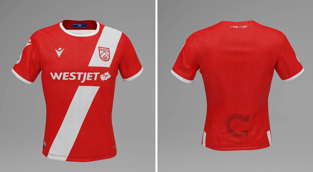
Cavalry FC home shirt. Courtesy Canadian Premier League
Cavalry FC’s home kit is a winner. The scarlet shirt with the white diagonal stripe, and black shorts and socks, is straight out of Latin America.
The slashed Cavs’ home jersey evokes images of Peru’s national team, Argentina’s River Plate and Brazil’s Vasco De Gama to name just a few. That the faux sash and colour scheme also serve as nods to Cavalry FC’s military connections only adds to the design’s story.
I know Cavalry FC’s green camouflage away jersey is already a favourite among some supporters. We can expect to see many a Cavs fan draped in army green come summer. Admittedly, it has some style and I’m warming to it. But does a solid dark army green jersey work from broadcasting perspective? I’m not sure I would have picked a tone of green specifically designed to blend in with grass.
Any CPL club facing Cavalry FC in those army fatigues may stand out on screen in comparison. But wait. Was that Cavalry FC’s plan all along? A strategy of stealth. Very clever, Mr. Wheeldon Jr. I see what you’ve done there.
That said, the red, white and black home kit is in no danger of blending in with any background. One hopes the diagonal stripe will become an iconic image on Calgary’s sporting landscape.
FC Edmonton away
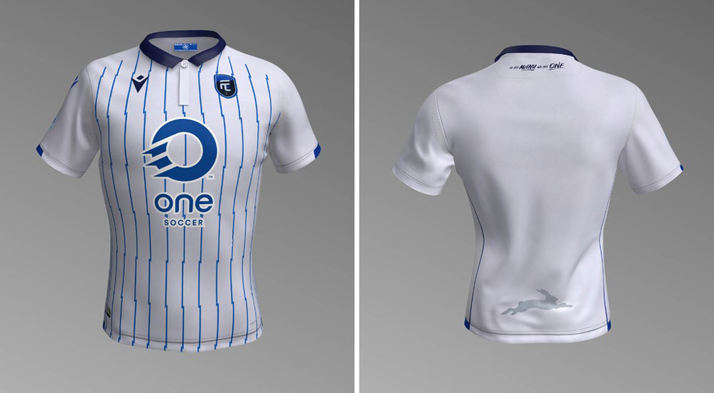
FC Edmonton away kit. Courtesy Canadian Premier League
Many footy fans love the white and coloured striped jerseys that populate European football. The traditional kits of Atletico Madrid, Juventus, Newcastle United, Sheffield Wednesday and Stoke City, to name a few, just ooze footy style.
So, it was somewhat disappointing not to see an equivalent CPL version on the runway at the league’s kit reveal party in early April.
FC Edmonton’s away kit is close – as close as we’ll get the first CPL season, anyway. And for that, it makes this list. The blue stripes are thin but do bring some understated style. A closer look reveals that the stripes have lightning bolt accents. Kewl… right?
The Eddies’ away kit is topped by a strong button-up collar. While a collar isn’t always successful, this one adds a measure of class.
We can only hope one of the league’s rumoured expansion clubs will go full Stoke City in 2020.
Forge FC home
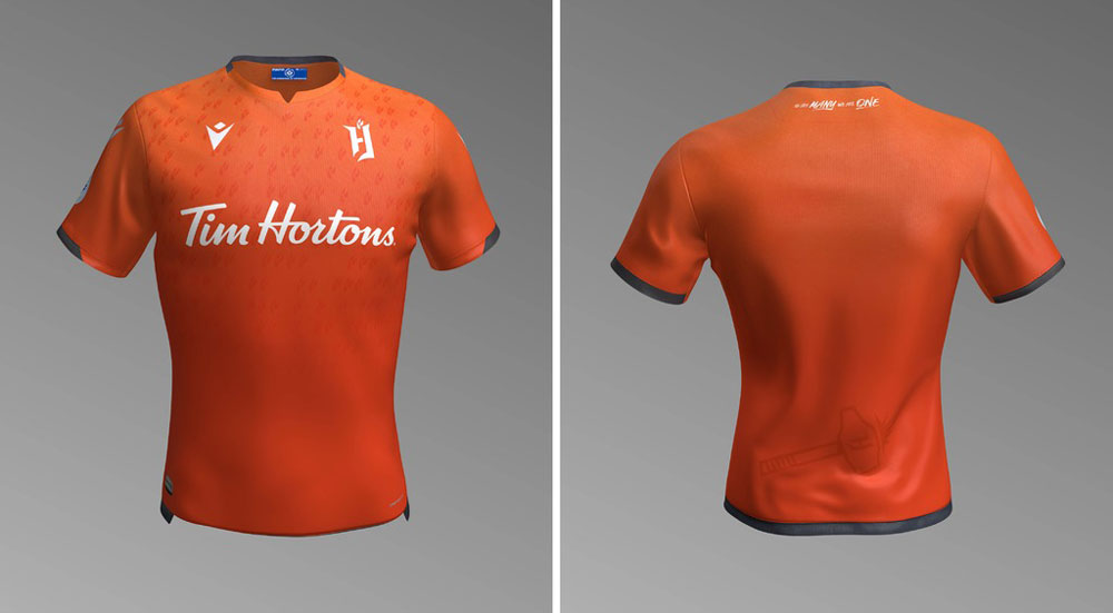
Forge FC home kit. Courtesy Canadian Premier League
When you think of the colour orange and football, one team immediately comes to mind. That’s right, Blackpool. No? Alright, two teams, Netherlands first, then Blackpool.
The Dutch national team and the club from the northeast coast of England share a tradition of orange jerseys. And the footballing world is all the better for it. Orange always looks brilliant out on a soccer pitch.
Forge FC will be the CPL’s orange-clad club. At first glance, the club from Hamilton looks to have kept it simple – orange with grey trim. But on closer inspection, one notices a pattern of the strange fire-like F things, from the club’s logo.
While I’m still not completely certain what they are (the club officially states they are “three sparks…representing the three foundational elements of Forge FC.”…sure, I’ll go with that.), the pattern of “sparks” does give the shirt a pleasing texture.
The grey shorts that accompany the jersey may not fully compliment a top of such quality. White shorts wouldn’t have been the unique option but, they would have helped the shirt pop. But, it’s a credit to the jersey’s vibrancy that it’s easy to forgive the shorts that try to support it.
Pacific FC home
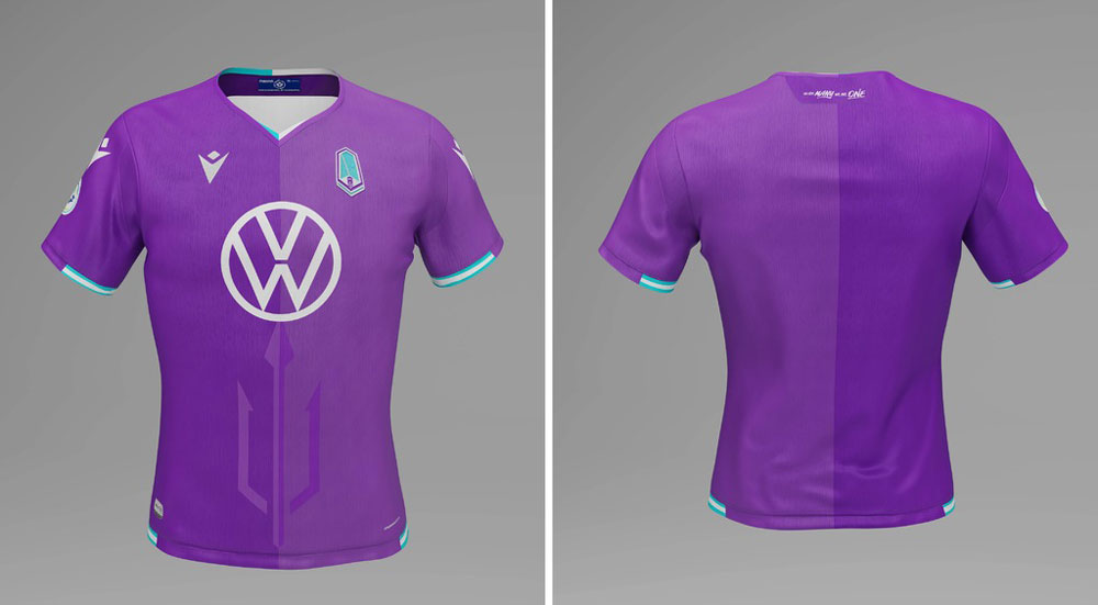
Pacific FC home kit. Courtesy Canadian Premier League
Pacific FC promised big things when it presented its logo and colour scheme at the club’s unveiling last year. And the club seems to have delivered on that promise. Purple and teal aren’t too common for football kits. But, the Vancouver Island club has achieved something bold and fresh with this primarily purple home kit.
As the CPL’s two waterfront properties, Pacific FC and Halifax’s HFX Wanderers have both successfully gleaned inspiration from their respective oceans. And while HFX Wanderers’ home and away kits are good, Pacific FC’s kit design also manages to feel distinctly west coast. Well done.
The designers even threw Poseidon’s trident at the shirt for good measure. But, will those of us with a sense of humour leaning toward the gutter chuckle at where the trident appears to be protruding from when worn? No, of course not. Grow up.
Nevertheless, this kit will look great in-person and on screens.
York9 FC home
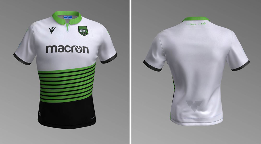
York9 FC home kit. Courtesy Canadian Premier League
There was an immediate sense of optimism from CPL fans when Macron was announced as the league’s official kit supplier last year. Here was an established, if somewhat under-represented in North America, clothing firm that has shown itself willing to think outside the box.
And so we have York9 FC’s home kit.
This effort perhaps makes this list more for what it was striving for than for how it turned out. Sometimes it’s good to be positive with an eye to future efforts.
Like most of CPL’s kits, there’s more going on here than first meets the eye. But that’s saying a lot for such a busy design.
The nine bright green stripes across the abdominals represent the nine municipalities of the York Region, borrowed from the club’s logo.
The white, green and black jersey is certainly unique within the league. It’s not dissimilar to Serie A club Lazio’s home kit, also a Macron design.
But, does anyone else think it could be mistaken for a tennis shirt? There may be a global marketing opportunity for York9 FC, should Milos Raonic be willing to don an XL at Wimbledon this summer. It might be worth shooting off a quick email to Canada’s top tennis star.
The Canadian Premier League is a new professional soccer league set to kick off in April 2019. Cavalry FC is Calgary’s club and will play its home games at Spruce Meadows.


