York United will be the new name and identity of the York region’s Canadian Premier League team the club announced Friday. The new name will replace the previous name and brand York9 FC.
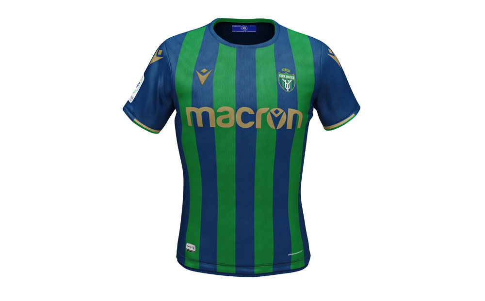
The re-branding comes with a new traditional-styled crest and updated colour scheme – blue has been added to green which was the club’s original primary colour.
A somewhat vague original brand, the club’s proximity to Toronto (and Toronto FC) and the COVID-19 pandemic have all been cited as contributing factors to the club’s struggles in establishing itself its first two years – the club had the lowest attendance of all the new CPL teams in 2019. But the club hopes the new name and identity will go someway to correcting any branding issues.
“Sometimes change is hard,” admitted York United President/CEO & General Manager, Angus McNab, via a league statement Friday. “But the key message here is that we take it on together and share in the exciting possibilities ahead. ‘York United’ perfectly captures our organization. We are an inclusive, warm, welcoming place and the solidarity is crucial to this new chapter.
“But this isn’t just about a name. This is about who we are and what we want to represent. There is connective tissue that binds York, Toronto and the GTA and we can’t simply ignore that. We are not just a number. We are bigger and better. We are united by a desire to progress and an ambition to be more.”

York United kit. Photo courtesy York United


